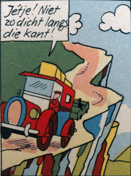
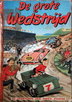
Koeleman might have never created a comics series if it weren't for his young nephews. One day in 1951 he visited his brother and heard that his sons read Hergé's 'Tintin'. Yet they couldn't get through the stories because the artwork was too fastidious and the plots too complicated. Koeleman decided to make a comic book especially for them. He imitated Hergé's artwork, but wrote a simpler story fit for young kids. Instead of a young adult like Tintin he made his protagonist a smart young boy, named 'Pinkie Pienter'.
Of: While Koeleman had artistic expertise it is clear that creating a children's comic book was quite a challenge for him. He went through great efforts trying to mimick Hergé's signature style, the “Ligne Claire” (“Clear Line”) and made a recognizable watered-down version, to say the least. Contrary to Hergé he kept his drawings simple and not too detailed. Everything is drawn in a loose style, without attention to anatomy, perspective, proportion or depth. Many backgrounds are very linear. All machinery, vehicles, planes, rockets, buildings, forests,... look unconvincing, while people and animals are stiff.
Overigens is het exemplaar van de strip dat ik vond er erg slecht aan toe: het valt dankzij royaal aangebracht plakband nog net niet uit elkaar. Maar ik heb er dan ook maar 30 eurocent voor betaald. Bovendien vond ik ’m vooral interessant vanwege de inhoud, niet om het object zelf. Al met al heb ik weer van alles geleerd.


Geen opmerkingen:
Een reactie posten